Most local business owners think of colour and typography as aesthetic choices — personal preferences about what looks good. In web design, they’re commercial decisions. The colours and fonts on your website affect how visitors feel, how much they trust your business, how easily they read your content, and ultimately whether they enquire.
This doesn’t mean you need a design degree to make good choices. It means understanding the principles behind these decisions so that when you’re working with a designer — or evaluating a design — you can assess it through a commercial lens rather than just a personal one.
Colour: Emotion, Trust, and Industry Signals
Colour communicates before content does. Within milliseconds of landing on a page, visitors form an impression based partly on the colour palette — and that impression influences everything that follows.
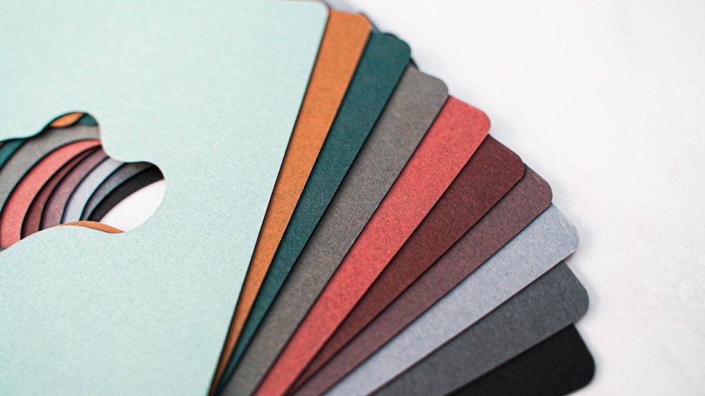
Different colours carry different associations in different contexts. Blues and dark neutrals tend to communicate professionalism, reliability, and trust — which is why they dominate financial services, legal, and B2B website design. Greens communicate nature, health, and growth — common in landscaping, wellness, and environmental businesses. Warm colours — oranges, reds, yellows — communicate energy and urgency, often used for calls to action.
There’s no single “right” colour palette for a local business website. The right palette is one that:
- Aligns with how you want to be perceived (trustworthy, energetic, premium, approachable)
- Is consistent with your existing brand if you have one
- Creates sufficient contrast between text and background for readability
- Uses a limited palette (typically two to three primary brand colours) applied consistently
Where many local business websites go wrong is colour overuse — too many colours applied inconsistently across pages, creating visual noise rather than clarity. A disciplined, limited palette applied consistently does more for professional perception than a wide range of colours used loosely.
Contrast and Accessibility
Beyond aesthetics, colour contrast has a direct functional impact. Text that lacks sufficient contrast against its background — light grey text on white, for example — is difficult to read, particularly on mobile screens in variable lighting conditions.
The Web Content Accessibility Guidelines (WCAG) recommend a minimum contrast ratio of 4.5:1 for normal text and 3:1 for large text. Beyond the accessibility argument, higher contrast simply means more of your content gets read — which directly supports conversion. A web designer on the Mornington Peninsula who builds with commercial intent will ensure contrast ratios are sufficient across every page.
Typography: Readability Is Conversion
Typography affects how much of your content actually gets read — and reading is the prerequisite for trust, which is the prerequisite for enquiry. Poor typographic choices reduce comprehension, increase cognitive effort, and cause visitors to scan rather than read.
Key typographic principles that directly affect conversion:
Font selection. Choose readable fonts for body text — typically sans-serif for digital content (like Inter, Lato, or Open Sans). Decorative or complex fonts may look distinctive in a logo but become tiring to read in paragraphs. Reserve distinctive fonts for headings and use something clean and readable for body content.
Font size. Body text below 16px is difficult to read on mobile without zooming. Most well-designed websites use 16–18px for body text and larger sizes for headings. Larger text is not less sophisticated — it’s more respectful of the reader’s experience.
Line height. Lines of text that are too closely spaced (low line height) or too widely spaced (high line height) reduce readability. A line height of 1.5–1.7 times the font size is generally considered optimal for body text.
Line length. Lines that are too long (over 80 characters) require the eye to travel too far across the page, making reading tiring. Lines that are too short feel choppy and interrupt flow. A line length of 60–75 characters is typically comfortable.
Hierarchy. Clear size and weight distinctions between H1, H2, H3, and body text help visitors scan the page and understand its structure. Without clear typographic hierarchy, pages feel flat and undifferentiated, making it harder to identify what matters most.
The Button Colour Question
Your call-to-action buttons deserve specific attention. A button that blends into the page — same colour as the background, insufficient contrast, low visual weight — will be missed by visitors who aren’t actively looking for it.
Effective CTA buttons are visually distinct from surrounding elements, high contrast against the background, large enough to tap on mobile, and consistent in colour and style across the site. The specific colour matters less than the distinctiveness — your CTA button should stand out from anything else on the page.
Putting It Together
Colour and typography decisions aren’t made in isolation — they’re part of a unified design system that determines how your entire website feels. When these elements are considered together, applied consistently, and optimised for readability and trust, the result is a website that converts better — not because of any single element, but because of the cumulative quality of the experience.
Browse our portfolio to see how typography and colour work across recent builds, or explore what’s involved in a full design-led build on the web designer Mornington Peninsula page. Ready to get started? Get in touch.
Frequently Asked Questions
Does the colour of my website really affect enquiry rates?
Yes — indirectly but meaningfully. Colour affects trust perception, readability, and the visual prominence of your calls to action. A poorly chosen or inconsistently applied colour palette can reduce the professional impression your website creates, which reduces conversion.
What’s the best font for a local business website?
There’s no single best font, but clean, readable sans-serif fonts like Inter, Lato, Open Sans, or Nunito are consistently effective for local business websites. The priority is readability at small sizes on mobile — choose fonts optimised for screen use rather than print.
How many colours should my website use?
Two to three primary brand colours, plus neutrals (white, light grey, dark grey, black) for backgrounds and text. More colours than this typically creates visual noise rather than clarity. Consistency of application matters as much as the number of colours.
Should my call-to-action buttons be a specific colour?
Your CTA button colour should be distinctly different from the dominant colours on your pages — it needs to stand out visually. The specific colour is less important than the contrast and consistency. Whatever colour you choose for CTAs, apply it consistently across the entire site.