Branding consistency is one of those things that’s easy to overlook when you’re focused on getting a website live. You have a logo, you’ve picked some colours, the site looks reasonable — job done. But inconsistency in how your brand presents across your website has a quietly corrosive effect on the trust visitors form as they move through your pages.
For local businesses on the Mornington Peninsula competing for attention online, consistent branding isn’t a luxury — it’s a structural element of how credibility is built and maintained.
What Brand Consistency Actually Means
Brand consistency means that every visual and tonal element of your website — colours, typography, spacing, button styles, image treatment, tone of voice — is applied uniformly across every page. A visitor moving from your homepage to a service page to your about page should feel a seamless, unified experience rather than jarring shifts in style or quality.
Inconsistency is often the result of a website that was built piecemeal — different pages added at different times, by different people, without a coherent design system governing the decisions. The result feels unpolished even when individual elements look fine in isolation.
How Inconsistency Erodes Trust
Trust is built through pattern recognition. When everything is consistent — the same fonts, the same colour palette, the same button style, the same image quality — visitors subconsciously register professionalism and reliability. The experience feels deliberate and controlled.
When things are inconsistent — a different heading style on one page, images that vary wildly in quality, a button that looks different on mobile versus desktop — the experience feels careless. Carelessness in presentation signals carelessness in other areas. That’s the association visitors make, even if they can’t articulate why the site feels “off.”
For service businesses where trust is a prerequisite for an enquiry, this matters commercially. A website that feels inconsistent generates fewer enquiries than an identical website with consistent styling — because trust is undermined before the visitor has finished reading.
The Design System: What It Is and Why It Matters
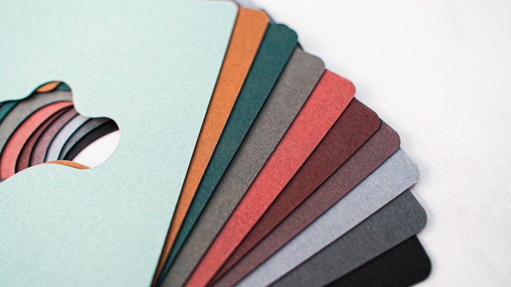
A design system is the set of rules that governs how your website looks and feels. It includes your brand colours (primary, secondary, and neutral), your typography choices (heading fonts, body fonts, sizes, and weights), your button styles, your spacing rules, and your image treatment guidelines.
When a website is built without a defined design system, every design decision is made ad hoc — which is how inconsistency accumulates. When a design system is established first and applied consistently throughout the build, every page feels like it belongs to the same website.
This is the approach taken when a web designer on the Mornington Peninsula builds properly — establishing a global styling system in the first phase of the project that governs every subsequent design decision.
Consistency Across Channels
Brand consistency extends beyond your website. The visual and tonal identity on your website should align with how your business presents on Google Business Profile, social media, email communications, and any printed materials.
When someone sees your Google Business Profile, visits your Instagram, and then lands on your website, the experience should feel unified. Inconsistency across channels creates a fragmented impression that reduces the cumulative trust built across multiple touchpoints.
For local businesses on the Mornington Peninsula, where many buyers encounter your brand across multiple channels before enquiring, this alignment has real commercial value.
Typography: The Underrated Trust Signal
Typography choices communicate brand personality more powerfully than most business owners realise. Clean, well-chosen fonts applied consistently signal professionalism. Default system fonts, inconsistent sizing, and poor hierarchy signal the opposite.
More practically, typography affects readability — which affects how much of your content actually gets read. Content that’s easy to read in a well-structured typographic hierarchy gets read. Content in a cluttered, inconsistent layout gets scanned for keywords and abandoned.
Image Consistency
Images are the most visible expression of brand consistency on most websites. Photos that vary wildly in style, quality, colour treatment, and subject matter create a disjointed experience. A consistent visual approach — similar colour treatment, consistent quality standards, coherent subject matter — ties the visual experience together.
This is one reason that investing in a consistent set of professional or well-shot photos at the start of a website project pays dividends throughout the site’s life. Inconsistent imagery is difficult to fix page by page — it requires a systematic approach.
Reviewing Your Own Consistency
Open your website and navigate through it as a visitor would — homepage, services, about, contact. Ask yourself: does every page feel like it belongs to the same website? Are the fonts the same? Are the buttons consistent? Is the image quality similar throughout?
If the answer to any of these is no, you’ve identified an area where targeted improvements will improve the trust perception your website creates. Browse our portfolio for examples of consistently branded builds, or get in touch to discuss how your website could be improved. Learn more about building with consistency in mind from a web designer on the Mornington Peninsula.
Frequently Asked Questions
Why does brand consistency matter for a small local business?
Because trust is built through consistent, professional presentation — and trust is what converts visitors into enquiries. Inconsistency signals carelessness, which undermines confidence in your business before a visitor has finished evaluating you.
How do I know if my website has branding consistency issues?
Navigate through your website on both desktop and mobile, page by page. If fonts, button styles, colours, or image quality vary noticeably between pages, you have consistency issues. A fresh set of eyes — from someone who doesn’t know your business — often spots these faster than the business owner.
Do I need a professional designer to achieve brand consistency?
Not necessarily — but you do need a defined design system and the discipline to apply it consistently. A professional designer establishes this system at the outset and applies it throughout the build, which is the most efficient way to achieve a consistent result.
What’s the most common branding inconsistency on local business websites?
Typography inconsistency is the most common — different heading sizes and weights used across pages without a defined hierarchy. Image quality inconsistency is a close second, particularly on sites that have grown over time with photos added from different sources.